Catchies
In 2015, Auckland Transport wanted to investigate all walking catchments around Auckland's busway, train, and ferry stations but didn't have the resources in-house to do so. So they called upon our Data Science Team to analyse and visualise the situation.
For them we created Catchies, an interactive map showing all such 10-minute, street-network, terrain-sensitive catchments, colour-coded by several selectable indicators. One indicator is population percentage, the ratio of the population in a walking catchment to the population in its corresponding idealized walking circle, which is one measure of walkability.
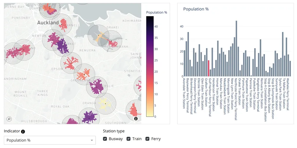
Using Catchies, Auckland Transport could quickly compare walking catchments across several different quality measures, then prioritize stations for walking access upgrades.
Since then, Catchies has become a popular visualisation, so as a public service in August 2021, we updated its data and interface.
Date: 2021-08-20
Tags: accessibility, public transport, walking & cycling
Comment